
For longtime wrestling fans—and even parents introducing their kids to the golden age of wrestling—few images capture the spirit of the 1990s like the glowing skyline of Atlanta at night. The WCW Atlanta City Lights Theme wasn’t just a backdrop; it was a carefully crafted blend of visual artistry, branding, and nostalgia that told viewers they were about to experience something larger than life.
This deep dive into the WCW Atlanta City Lights Theme explores how that mesmerizing city-at-night look became the emotional and visual touchstone of WCW programming. More than flashing lights or a skyline shot, it symbolized WCW’s Southern roots, its pride in Atlanta, and its ambition to stand tall in the world of professional wrestling.
Origins & Cultural Significance Of The Theme
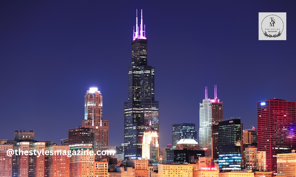
Every great wrestling promotion has a signature look, and for WCW, nothing stood out more than the glowing Atlanta skyline. The WCW Atlanta City Lights Theme wasn’t just a visual—it was a statement of identity. It showed pride in the city where WCW was built and helped the brand connect with fans through both history and modern style.
Why Atlanta?
Atlanta was more than just a location—it was the very heartbeat of WCW. The company’s headquarters sat in the city, making its skyline a fitting symbol of pride and identity. By using the illuminated towers and glowing nightscape, WCW created a theme that reflected its connection to the South while also projecting the image of a major national brand.
For local fans, it was a reminder that WCW was “their” promotion, rooted in their hometown. For audiences across the country, the skyline suggested scale, energy, and ambition—qualities that positioned WCW as a true competitor in the wrestling world.
Southern Roots with a Modern Edge
The WCW Atlanta City Lights Theme also captured a unique balance between old and new. Southern wrestling had long been known for its gritty, grassroots style, often tied to small arenas and passionate local crowds. WCW didn’t abandon that heritage—but by showcasing Atlanta’s glittering skyline, it added a modern, cosmopolitan flavor.
This combination sent a clear message: WCW respected its history while also looking forward. The city lights represented progress, sophistication, and growth, making the brand feel both authentic to its roots and ready to stand tall on the global stage.
Visual Elements & Design Mechanics
The success of the WCW Atlanta City Lights Theme didn’t rely only on the idea of showing a skyline—it came alive through its visual details. Every element, from the glowing horizon to the sharp typography, worked together to create a powerful first impression. For fans watching at home, these visuals set the tone before the action even began.
Skyline Silhouette & City Lights
One of the most striking features was the contrast between the dark outline of Atlanta’s skyline and the sparkling city lights. Against a night sky, the glowing windows and neon signs created a sense of depth and drama. This design not only looked cinematic but also gave WCW a larger-than-life presence, something viewers associated with excitement and spectacle.
Color Palette & Mood
The color choices played a big role in the atmosphere. Deep blues and purples suggested nighttime energy, while touches of gold and bright highlights gave the theme a sense of prestige. Together, these tones made the visuals feel both vibrant and professional—perfectly balancing entertainment with authority.
Typography & Branding Integration
The fonts WCW used weren’t random; they were bold, modern, and deliberately layered over the skyline. This integration made the brand unforgettable. Every time the logo appeared against the glowing cityscape, it reinforced WCW’s identity as a serious competitor on the wrestling stage. The combination of strong text and dramatic visuals ensured instant recognition for fans.
Technical Visuals: Production Techniques Of The 1990s
Behind the scenes, WCW’s production team used techniques that were cutting-edge for their time. Time-lapse shots of the city gave the skyline movement, while compositing layered logos and effects onto the visuals. Color grading enhanced the glow of the lights, and early motion graphics added transitions that kept the theme dynamic. For 1990s television, this level of polish stood out and made WCW broadcasts feel more like high-end productions than simple wrestling shows.
Audio Dimensions: Was It Also Music?
While the WCW Atlanta City Lights Theme is most often remembered for its stunning visuals, there’s an ongoing discussion among fans about whether it also existed as a musical track. Wrestling has always relied heavily on sound—entrance themes, background music, and opening scores—to build excitement. So it’s natural to wonder if the city lights weren’t just seen, but also heard.
Visual vs. Musical Usage
The visuals of the Atlanta skyline are well documented, but some accounts suggest that the “City Lights” theme may also have been paired with an audio track. Certain broadcasts and live events hinted at background music tied to the skyline imagery, though these mentions are less concrete than the visual evidence. This leaves the theme in an interesting space: primarily a visual identity, but possibly supported by audio elements that reinforced WCW’s branding.
Emotional Connection Via Sound (Speculative)
If the city lights were accompanied by music, the effect would have gone beyond visuals. Audio branding is powerful in building memory and emotion—think of how a few notes from a classic entrance theme can transport fans back decades. Even a simple instrumental behind the glowing skyline could have deepened the nostalgic connection, giving fans not only something to watch but something to feel.
The speculation itself shows how deeply WCW’s presentation resonated with its audience. Whether through imagery or music, the Atlanta City Lights Theme became part of the sensory experience that fans still remember today.
Industry Impact & Legacy
The WCW Atlanta City Lights Theme wasn’t just a striking opening—it reshaped how wrestling promotions thought about presentation. By blending cinematic visuals with strong branding, WCW set a standard that others would follow. Its influence can still be seen today in wrestling and beyond.
Raising The Bar In Wrestling Production Design
Before WCW embraced the city lights look, many wrestling shows relied on simple graphics and basic stage shots. WCW’s decision to spotlight Atlanta’s skyline signaled a shift toward polished, cinematic production. This urban, location-based branding gave viewers the sense that they were watching something grand and modern. Soon, other wrestling companies began experimenting with bigger visuals, flashy intros, and more dramatic stage designs—making this approach the new industry norm.
Competitive Branding Edge
The theme also gave WCW an edge in how it was perceived. For regional fans, it reinforced pride in the South. For mainstream audiences and potential advertisers, the skyline visuals made WCW look professional, credible, and ready for prime time. By combining emotional connection with corporate polish, WCW built a brand identity that was both memorable and marketable.
Lingering Influence
Decades later, the legacy of WCW’s city lights theme still shines. Modern wrestling promotions and even non-sports media often use skyline motifs, neon lighting, and cinematic cityscapes to create a sense of identity and scale. In many ways, WCW’s decision to anchor its brand to Atlanta’s skyline paved the way for today’s emphasis on location-based storytelling in entertainment. The glowing city at night remains a timeless image, reminding fans of how WCW once lit up their screens.
Design Lessons For Creators & Parents Sharing With Kids
The brilliance of the WCW Atlanta City Lights Theme isn’t limited to wrestling history. Its design choices—skyline silhouettes, glowing palettes, and bold branding—offer valuable lessons for creators, designers, and even parents looking for fun, creative projects to share with their kids.
Learning From WCW: Takeaways For Visual Branding
One of the clearest lessons is the importance of picking imagery that tells a story. WCW chose Atlanta’s skyline because it was instantly recognizable and full of energy. Creators today can do the same by:
- Selecting iconic landmarks that connect to their own identity.
- Using mood-driven color palettes (like dusky blues or golden highlights) to set the emotional tone.
- Blending typography with imagery so that words don’t just sit on the screen but become part of the design.
At its core, WCW’s city lights theme was about emotional storytelling. A single cityscape could transmit pride, ambition, and excitement all at once.
DIY “City Lights” Theme Projects For Families
Parents can turn these design lessons into fun activities with their kids. A few easy ideas include:
- Bedroom or craft space mural: Create a city skyline effect with glow-in-the-dark stickers, cutouts, or stencils. When the lights go out, the “city” comes alive.
- School posters or event invites: Encourage kids to design with city silhouettes, layering dark building shapes over bright sunset or night colors for a dramatic effect.
These small projects can inspire creativity while also teaching kids how visuals communicate mood and meaning.
Expert Insight (Imagined)
As one graphic designer might put it: “Cityscapes evoke dramatic scale and emotion—they anchor viewers in place and imagination.” This timeless principle explains why the WCW Atlanta City Lights Theme worked so well, and why similar motifs continue to appear in modern media today.
Conclusion
The WCW Atlanta City Lights Theme was never just about flashing neon or skyline shots. It was a carefully crafted identity that blended regional pride, technical creativity, and cinematic ambition. By grounding itself in Atlanta, WCW created an image that felt both authentic and larger than life—a balance few wrestling promotions achieved at the time.
Today, the theme lives on not only as a piece of wrestling history but also as an inspiration for visual storytelling. Families and creators alike can take cues from its design—whether in branding projects, classroom posters, or even a city-themed nursery wall.
Whether revisiting the WCW Atlanta City Lights Theme for nostalgia or reimagining it for your own creative spaces, its glow still lights up imaginations.
FAQs
What Was The WCW Atlanta City Lights Theme?
It was a visual theme featuring Atlanta’s glowing skyline, used by WCW to represent its identity and pride.
Why Did WCW Choose Atlanta For The Theme?
Because WCW’s headquarters were in Atlanta, the skyline became a natural symbol of its roots and ambition.
Was The City Lights Theme Also Used As Music?
Mainly remembered for visuals, but some fans recall it may have also appeared as background music in broadcasts.
Does The Theme Still Influence Wrestling Today?
Yes, modern wrestling and media still use city skylines and cinematic visuals inspired by WCW’s approach.
Thank you for exploring our Blog! For additional captivating content, feel free to explore the corresponding category.
Disclaimer: This content is provided for general informational purposes only. While the information is based on publicly available sources, it should not be considered legal, medical, financial, or professional advice. Readers are advised to consult a qualified expert before making any decisions based on the information shared here.